Welcome to our farmhouse kitchen at Windy Hill. I explained in a previous blog post, why we love historic homes, so today I wanted to share with you some of the farmhouse renovation hacks we’ve used over the years.
We began minor family-friendly renovations the minute we moved here in 2007, and we continue to make them because we are still not finished and we recently listed our farm on homeexchange.com.
As we begin this exciting journey of home exchanging for travel I thought I’d share some of the ways we previously restored rooms, gardens, and outbuildings and how we’re simplifying to make our home exchange-worthy for guests. I will break these down by project so look for them in future blogs.
Farmhouse renos can unveil difficult challenges, objects of educational interest, and sometimes disturbing artifacts. Even a small change can prove difficult. But we didn't let that discourage us during this kitchen construction project because as we uncovered the years we looked for creative design elements and clever ways to get what we wanted and needed, disguising many imperfections along the way.
Paint
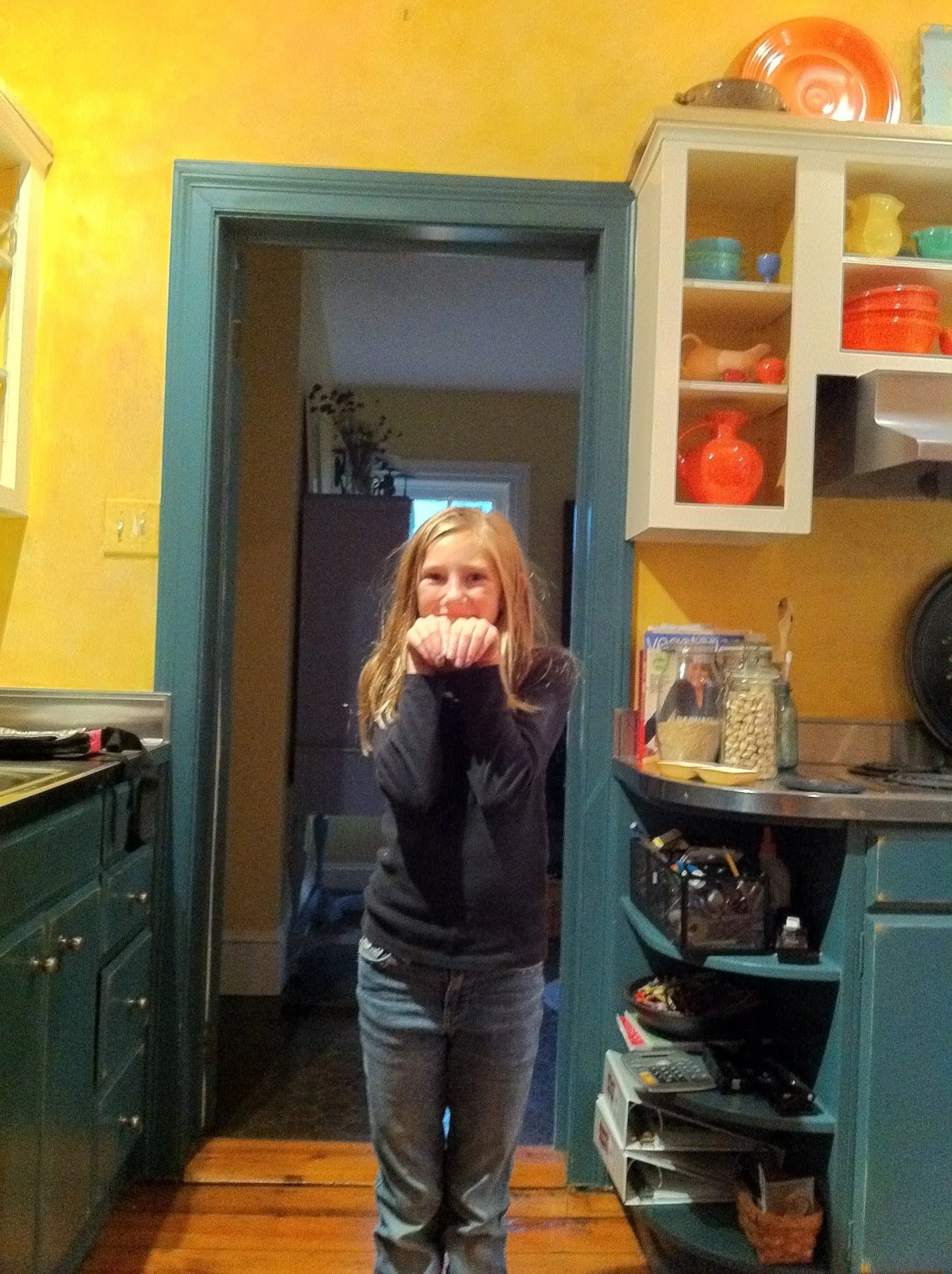
Neutralize and calm: When we moved here in 2007 this kitchen was a bright and cheery, yellow and teal, "French Country", a vintage farmhouse style you see a lot. The cabinets and trim were teal, while the walls were a rag-rolling yellow. We promptly inserted our Fiestaware collection on the open shelves and lived with it for a short while. But after a few years, it was looking pretty worn and dated, so we made the decision to renovate the kitchen.
For the renovation we decided not to do traditional white walls, instead, we painted them a light gray and opted for white cabinets, white trim (to match the rest of the house), and eventually a white island piece. We chose Benjamin Moore's White Dove as it’s a soft, mellow white. The kitchen always had vintage stainless steel appliances, so as needed we slowly upgraded with new appliances and I think they complement the updated neutral colors well.
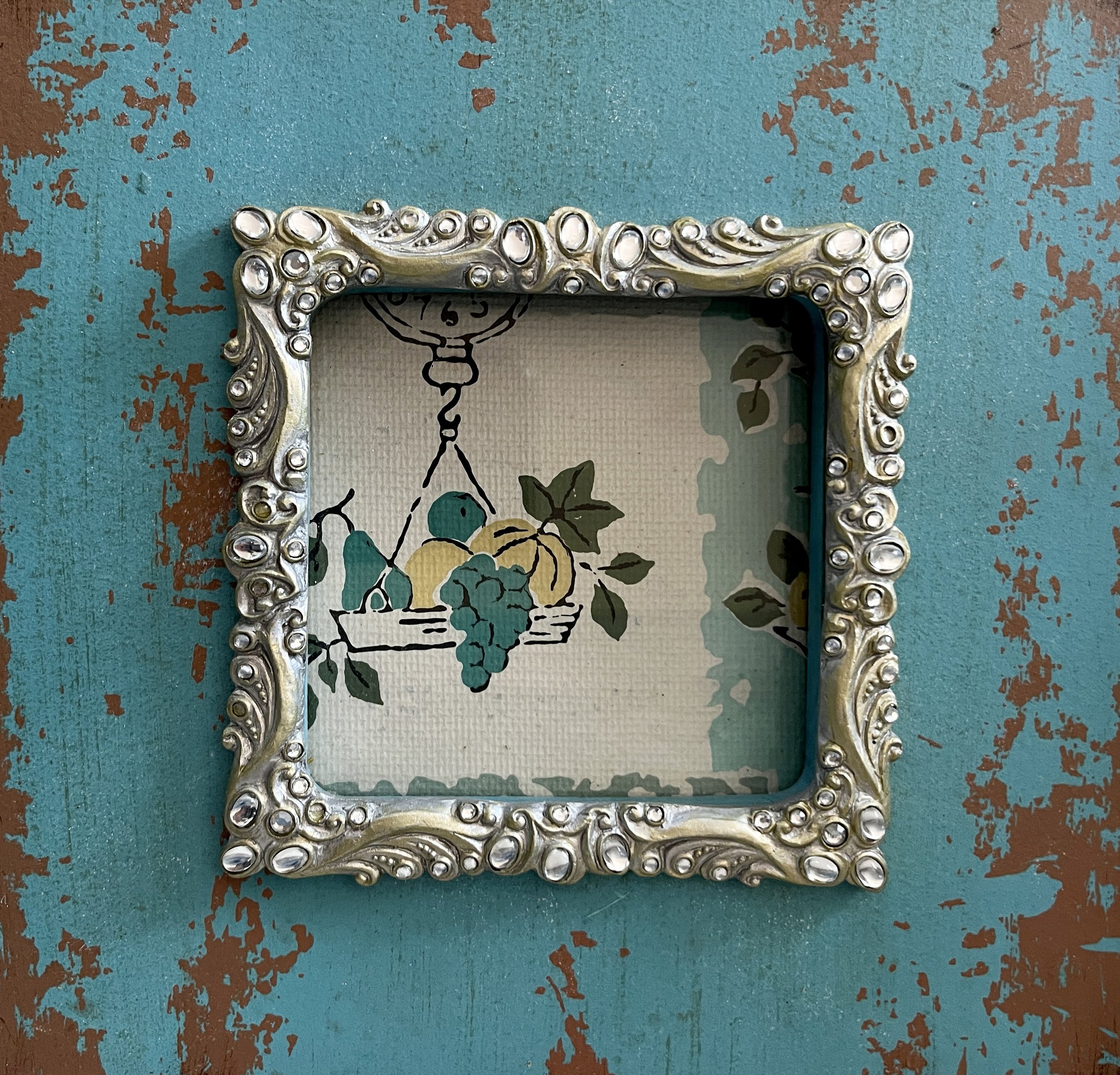
When we dug in, we found vintage wallpaper remnants under some of the upper cabinets. It was clearly a 1950s fruit pattern, so I imagine this is why the woodwork was originally painted teal even though the rest of the house trim was already painted white. As we peeled some of that old wallpaper away, I was quick to frame a small fragment.
Wall Removal
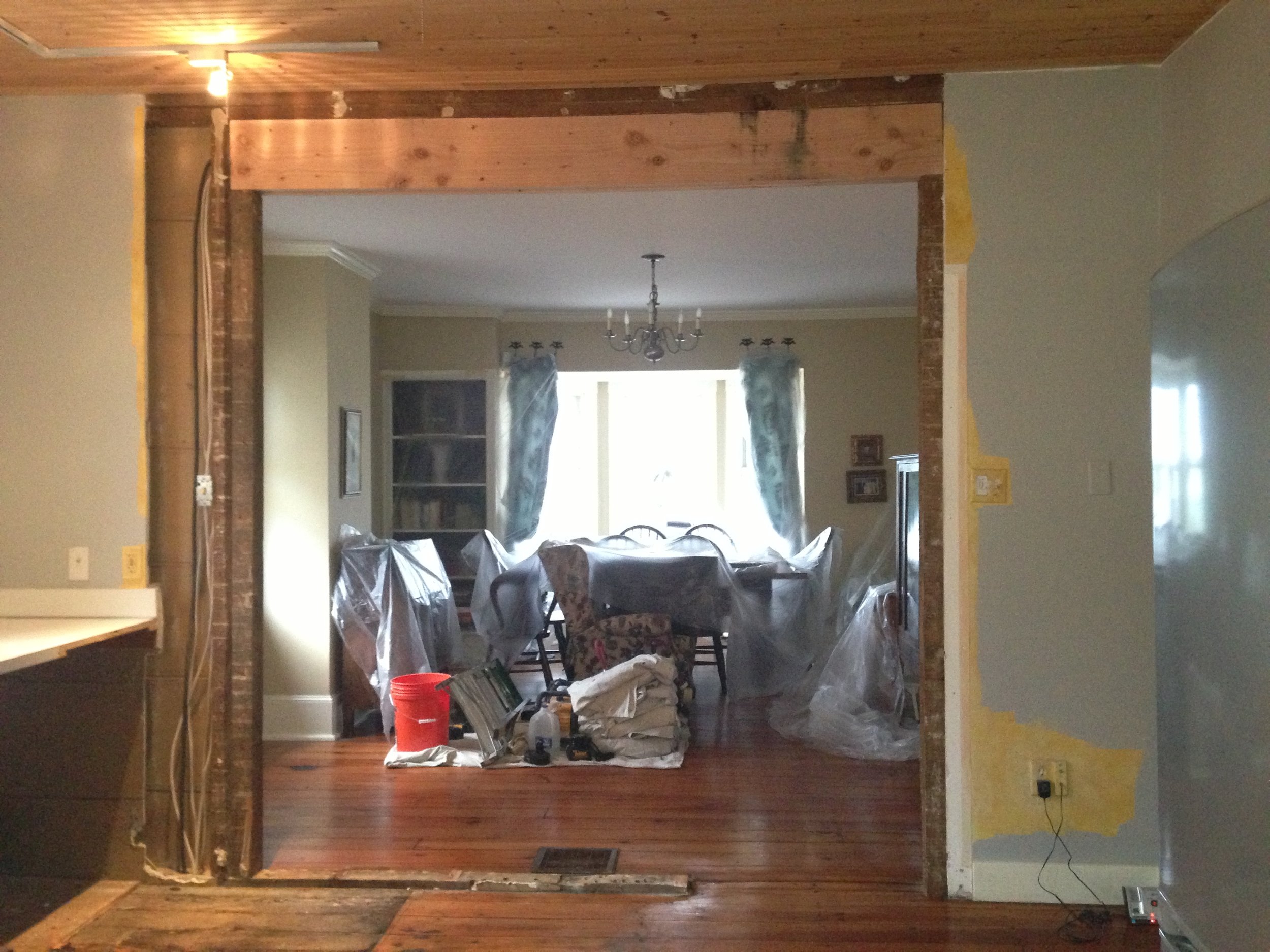
The biggest change: By far our best idea was to remove the entire wall that housed the refrigerator and a small doorway to the dining room. By far, it was the best idea for this kitchen and my husband gets all the credit for that one. In fact, he even designed the double french doors, window wall, and transom we have now.
Our contractor found horse hair used for insulation when he removed this wall and he needed to install a support beam so the rest of the house wouldn't come down. But other than that, the construction of this section went rather smoothly. We had to patch the hardwood floor in some places but opening this wall really created a new space for us which lets in much more natural light while the french doors still provide privacy when needed. If you’re thinking of doing something like this, be sure to use an insured contractor with a very good reputation, because you never know what you may find.
Kitchen IslanD
Flexible and Versitile: Because we opted for only one set of open shelves and no upper cabinets, we had to come up with farmhouse design ideas for storing unsightlies like water bottles, small dishes, and spices. This kitchen is not that big, therefore a large custom island with seating, as you see in modern kitchens, was out of the question. I wanted to find a solution that was versatile, movable, and ultimately removable if I someday grew tired of it and wanted to change my style.
So one day while thrifting with my sister-in-law, I came across an antique brown buffet that was narrow enough to fit the space but long and high enough to actually be useful. As luck would have it, it was half-price day, so I snagged it for under $200. We lived with it intact for a few years, until one day I brought out the brushes and painted the bottom white with a chalkboard painted top. The chalkboard black paint is almost the same tint as the new soapstone countertop which is from Bucks County Soapstone. I just love the way it looks plus it provides extra counter space. It’s “flexible” and it encourages much fun in the kitchen because we can write and draw on it when entertaining plus keeping the paint close at hand makes touch-ups easy. And if someday I find something better, I won’t have the price agony weighing me down.
Cabinet Repurposing
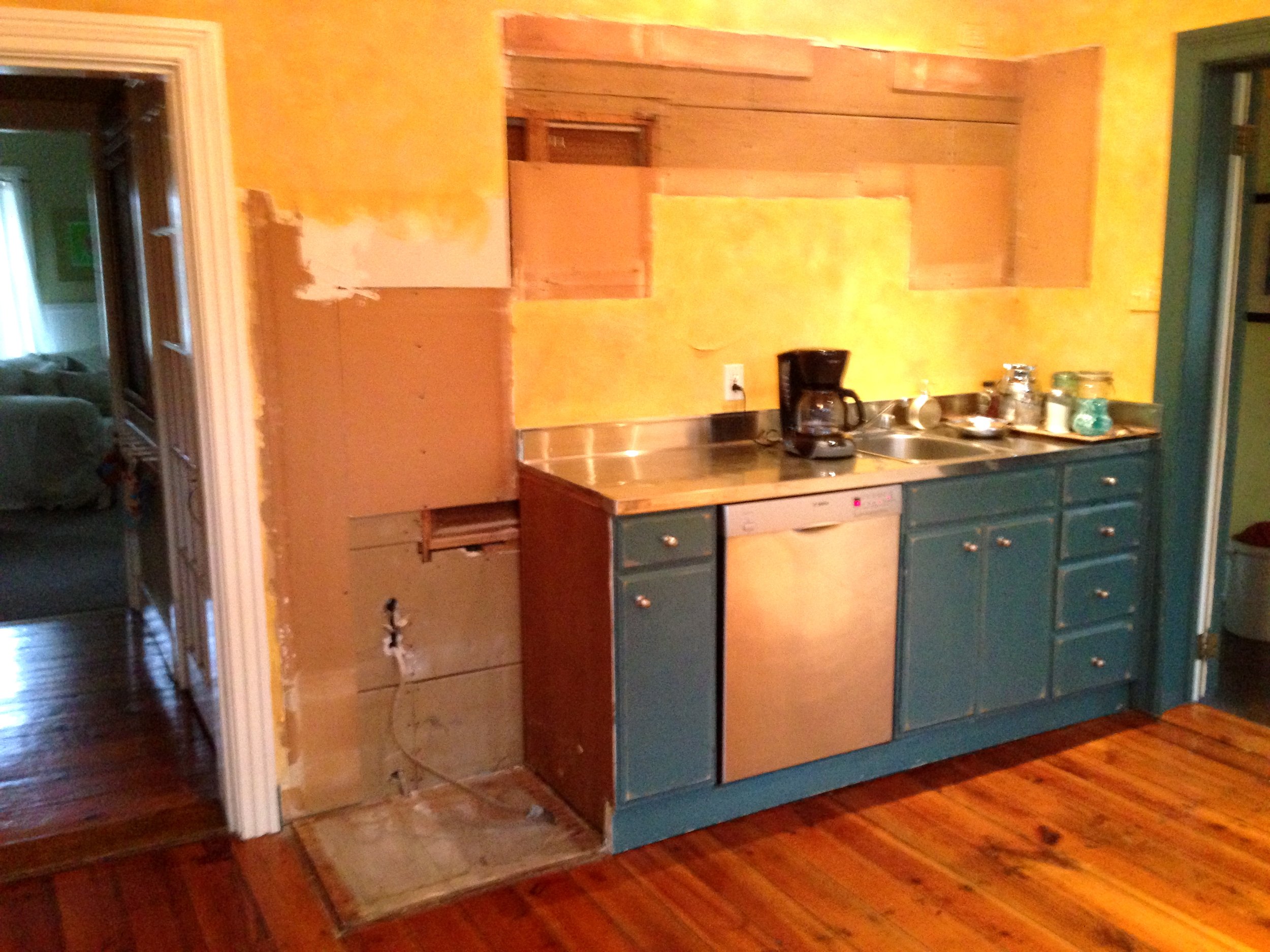
Big cost savings: We opted out of buying new custom cabinetry, and instead, reused the existing lower cabinets which originally spanned all four walls of the kitchen. However, in several places, we did have to completely disassemble some and piece them back together a little differently so that we could move around or eliminate appliances like the refrigerator and wall oven. We called it the great cabinet shuffle.
So I guess you could say we have some custom cabinetry in a sense as our contractor knocked out the rounded shelves and gave us a small storage space instead next to the range. He also rebuilt the cabinet under the main sink to accommodate the new stainless apron sink we wanted to add centered under the 3 windows (shown above) which existed before we arrived. We also repurposed some leftover upper open shelves (which were pretty ugly), transforming them into glass-fronted cabinets with crown molding as an accent above the range hood.
I found these glass doors below at an antique shop, and as I often do, I brought them home having no idea where I would use them. But when I discovered that they somehow fit the kitchen windows perfectly I used them to highlight the middle window and set it off above the sink. It reminds me of the open shutters I’ve seen in France. Some new hardware, a few antique accents, and a little white paint, and this old house was coming along nicely.
Coffee Bar
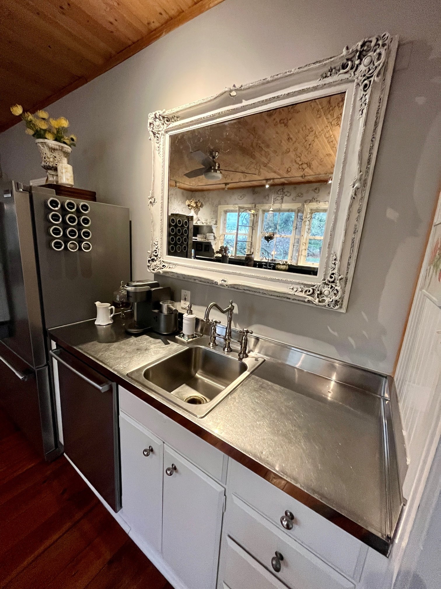
Using found objects: One side of the kitchen came with a small clean-up sink and dishwasher. It's a great bonus space that older farmhouses usually don't enjoy. In the original kitchen, the very old double wall oven used to be on the left, but with the renovation, we moved the refrigerator to that space and kept the little sink, dishwasher, and lower cabinets much the same. If you look closely you’ll see a window peeking out of the wall. That’s the kind of surprise that’s very exciting. I spent days trying to rearrange where the fridge could go so that I could expose that window because it looks right into the refurbished pantry. Finding this was so perfect, but I could not find another space for the fridge and so we had to sacrifice the window….for now.
Since coffee is a big part of my mornings, we transformed this area into a little coffee bar. And what does every coffee bar need, but a big chunky mirror above it? This is my favorite part because the mirror I used didn't cost anything. In fact, I found the wooden frame alongside the road one day. It was just abandoned by its owner never to be used again, or so they thought. I grabbed it, cleaned it, painted it, took it to the local glass shop, and had it fitted with new antiqued mirror glass. Yes, this is something you can actually buy. I just love the way it turned out and how it fits perfectly in the space. It's a great way to repurpose an old frame that you can't part with and it’s a conversation piece for sure. Start hunting for yours.
Here are a few detailed photos of the mirror, Kingston Brass faucet, magnetic spice tins, etc. You can find links to most of these items and/or items with similar styles on Studio Sprig’s Shop My Home page.
I like to keep a little vintage-style pitcher next to the coffee maker so that I can easily fill it. I store my coffee grounds in a pretty apothecary jar and I use a stainless, beaded scooper created by an artist at a craft fair. I’ve linked a really nice copper coffee scooper here. The apothecary jar and soap dispenser sit upon artistic tiles made by my children.
Glassware Storage
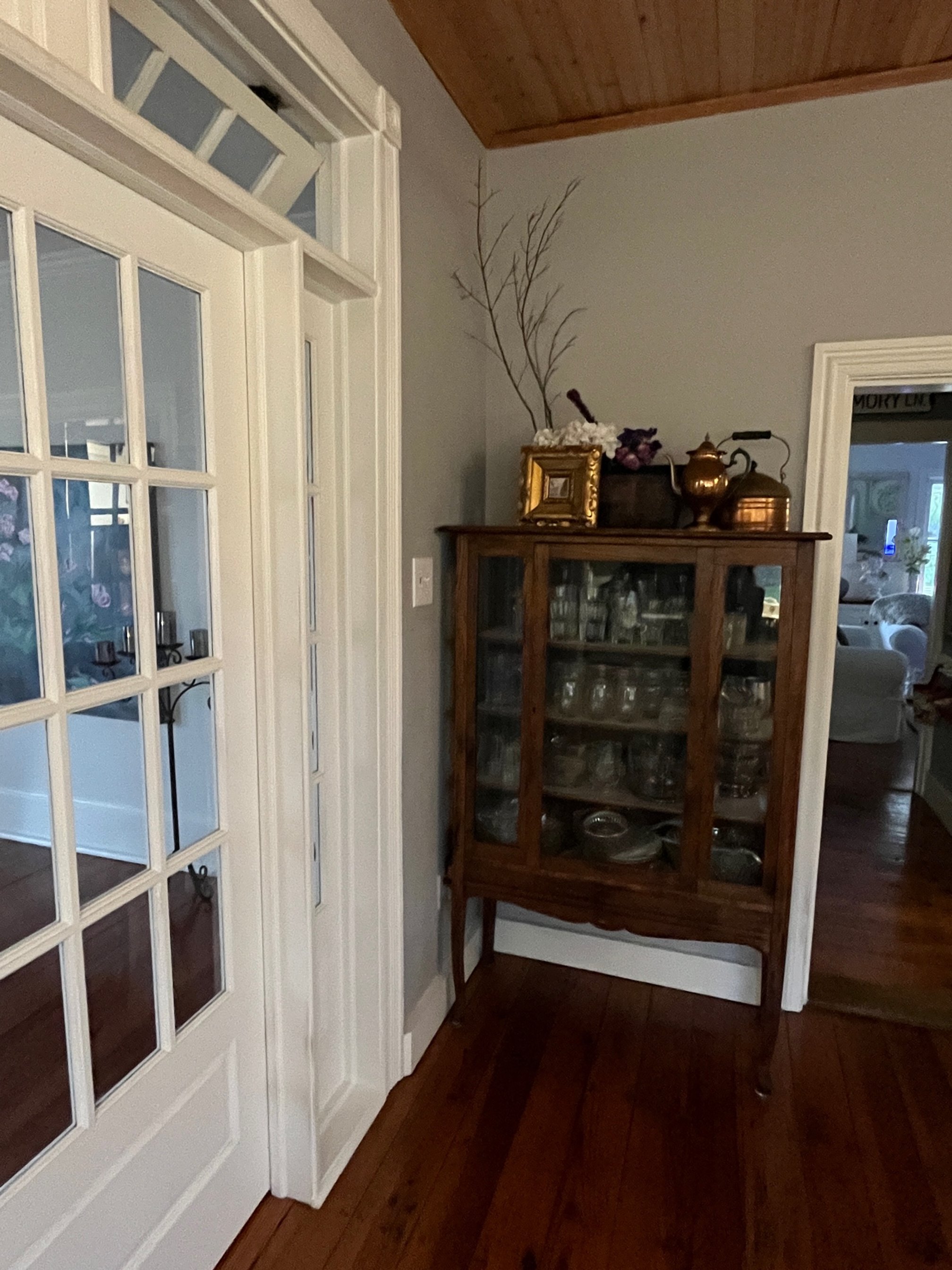
With the elimination of upper cabinets comes the realization that you'll need a place to put all of your glassware. Many years before purchasing this farmhouse, I purchased this delicate hutch at a yard sale. It was in great shape so I stripped the varnish and exposed the woodgrain as soon as I brought it home. It moved around inside various homes until finding a perfect vocation in this kitchen as the keeper of all things glass. Drinking glasses, glass bowls, glass dishes, and random glass items that need a place to perch.
There's a little section of wall where it fits very nicely and here it will undoubtedly remain forever, or until I change my mind. I like having all of my glassware in one perfect place and the glass doors encourage me to keep it neat and tidy.
Thank you for visiting my kitchen. If you are interested in some of the products or product styles we used, here is a pretty comprehensive list with links for your convenience. Shop my home. I am happy to answer any questions you may have about the transformation if you comment below. If you’re a blogger, what’s your favorite SEO Tool? I’ve had much keyword success with RankIQ. Learn more here.


